How to Create a Dashboard App for Your Team
August 12, 2026PUBLISHED INAi Development
 ali
ali 2026-08-12 14:58:00
 0
0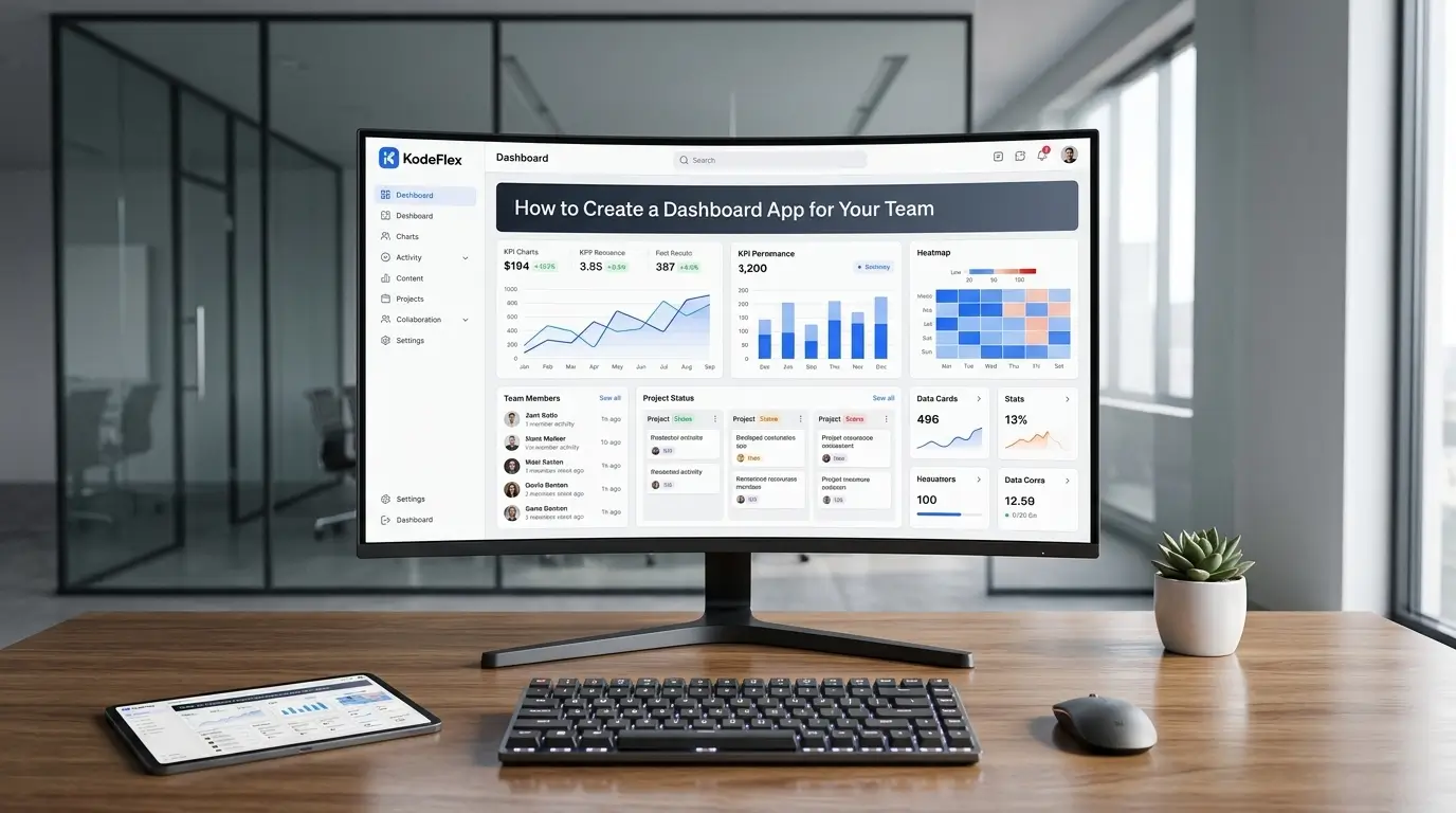
Most teams eventually hit the same wall: important numbers exist somewhere, in a spreadsheet, a database, another internal tool, but nobody has one place to actually look at them together. A dashboard app solves that by pulling the data that already exists into a single view, without requiring a full business intelligence platform for what's often a fairly focused set of metrics.
Here's how to build one, and what actually separates a useful dashboard from a wall of numbers nobody checks.
Step 1: Decide What the Dashboard Actually Needs to Answer
The most common mistake in dashboard building is trying to show everything. Start instead with the two or three questions people actually ask repeatedly, how many open tickets do we have, what's this month's revenue against target, how many requests are overdue. A dashboard built around specific questions gets checked daily. One built as a general data dump gets ignored within a week.
Step 2: Identify Where the Data Actually Lives
Before building the visual layer, map out where each piece of data currently sits, another app you've built, a spreadsheet, a connected data source. This matters because the dashboard is only as good as its connection to real, current data. A dashboard showing numbers from a spreadsheet nobody updates anymore is worse than no dashboard at all, since it creates false confidence.
Step 3: Generate the Dashboard From a Description
Describe what you need to KodeFlex in plain language, something like "a dashboard showing open support tickets by status, average resolution time this month, and a list of tickets overdue by more than 3 days." The platform generates a working structure: the relevant charts and views, pulling from your existing data if the dashboard is connected to another app already built on the platform.
Step 4: Choose the Right Visual for Each Metric
Not every number needs a chart. A single important figure, this month's revenue, current open ticket count, is often clearer as a large number on its own than buried inside a chart. Trends over time work well as line charts. Comparing categories, tickets by team, works well as a bar chart. Resist the instinct to make every panel visually elaborate, the goal is fast comprehension, not visual complexity.
Step 5: Set Up Who Sees What
Decide whether this is a dashboard for one team or something leadership will also check. Sensitive figures, individual performance metrics, detailed financials, may need to stay restricted to certain roles even if the broader dashboard is shared team-wide. Configure this at the same time you build the dashboard, not as an afterthought once it's already been shared broadly.
Step 6: Test That the Numbers Actually Update
Before rolling the dashboard out, confirm the data is actually live, not a snapshot from whenever it was built. Make a change in the underlying data source and check that it reflects on the dashboard. Use instance management to test layout or metric changes on a staging version before altering the dashboard people are actively checking day to day.
When a Custom Dashboard Fits vs a Dedicated BI Tool
A self-built dashboard works well for a focused set of operational metrics tied to a specific team or process, support tickets, project status, request volume. It's a weaker fit for complex, cross-source data analysis with heavy statistical modeling or large-scale enterprise reporting across dozens of data sources, that's where dedicated BI platforms like Tableau or Power BI still earn their complexity.
Frequently Asked Questions
Can the dashboard pull data from an app I already built?
Yes, if the underlying data lives in another app built on the same platform, the dashboard can reflect it without a separate data pipeline.
How often does the data update?
This depends on how the dashboard is connected to its data source. Confirm during setup whether updates are real-time or on a set refresh interval.
Can different people see different parts of the dashboard?
Yes, role-based visibility can restrict sensitive panels to specific users while keeping the broader dashboard shared more widely.
How long does it take to build a basic dashboard this way?
Most teams have a working draft in the same session, with visual refinements and access rules adjusted shortly after.
Is this a replacement for a full BI platform?
For a focused set of team-level metrics, often yes. Complex, large-scale enterprise analytics across many data sources usually still benefits from a dedicated BI tool.
Want to build a dashboard around your team's actual metrics?
Request a demo and walk through what you need to see
Related Blogs
How to Build a Leave Management System